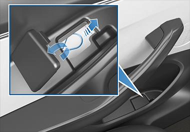
Actively Dangerous Design
Questionable button placement in a payment flow is one thing, but it should always be intuitive to complete a basic safety flow in a vehicle.

There’s frequently discussion amongst product engineers about “user hostile design”, and reasonably so because the industry is full of dark patterns that drive business value but not user value.
But all that is put into perspective when you see an example of actively dangerous design like the doors of a Tesla when the primary unlocking system fails.
This design could literally cost lives and I’m shocked it made it past the initial prototypes.
